Superbowl Predictions

ESPN recently published a list of “expert” predictions for Superbowl 50.  Seventy writers, analysts, and pundits predicted the final score of the upcoming game between the Carolina Panthers and the Denver Broncos.  I thought it might be fun to crowdsource a single prediction from this group of experts.

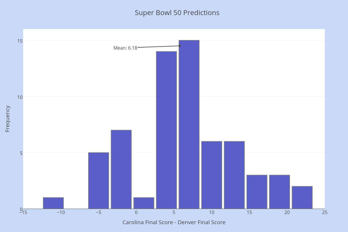
Below is a histogram showing the predicted difference between Carolina’s score and Denver’s score.  The distribution looks fairly normal (symmetric and unimodal).

Super Bowl 50 Predictions

The average difference is 6.15 points, with a standard deviation of 7.1 points.  Since we are looking at Carolina’s score – Denver’s score, these predictors clearly favor Carolina to win, by nearly a touchdown.

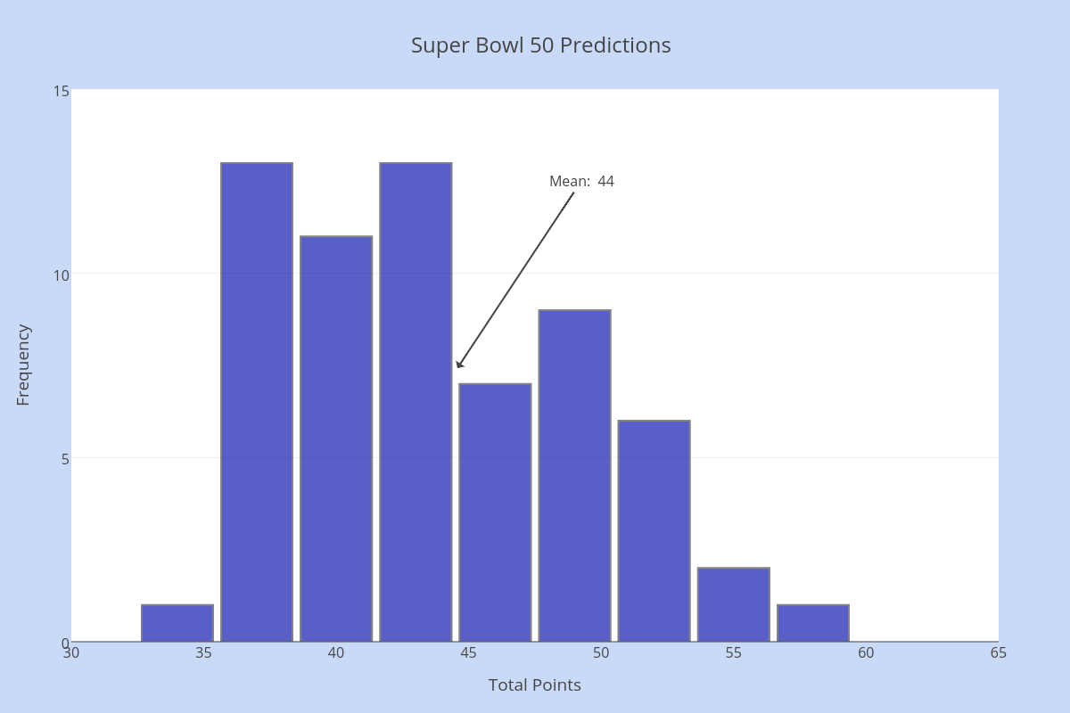
This second histogram shows the predicted total points scored in the game.  The average is 44 points, with a standard deviation of 5.7 points.

Super Bowl 50 Predictions -- Total Points

Combining the two statistics, let’s say that the group of ESPN experts predict a final score of Carolina 25 – Denver 19.  We’ll find out just how good their predictions are tomorrow!

[See the full list of ESPN expert predictions here.]

Regents Recap — August 2015: Modeling Data

Here is another installment in my series reviewing the NY State Regents exams in mathematics.

Data and statistics play a much bigger role in algebra courses now, due in part to their increased emphasis in the Common Core standards.  I am generally supportive of this, but I do worry about how statistical concepts are presented and assessed in these courses and on their exams.

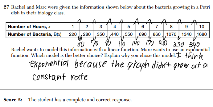
For example, here is question 27 from the August, 2015 Common Core Algebra exam.

2015 August CC Alg 27

Evaluating mathematical models is an extremely important skill in many aspects of life.  But properly evaluating mathematical models is subtle and complex.

The following sample response, provided by New York state as an example of an answer deserving of full credit, does not respect that complexity.  And it makes me worry about what we are teaching our students about this important topic.

2015 August CC Alg 27 MR 1

It’s true that the given data does not grow at a constant rate.  But that isn’t a good reason to reject a linear model for this set of data.  Models are used to approximate data, not represent them perfectly.  It would be unusual if a linear model fit a real set of data perfectly.

The weakness of this argument becomes even more apparent when we notice that the data isn’t perfectly fit by an exponential model, either.  Therefore, how could it be wrong for a student to say “We should use a linear model, because the data doesn’t grow at a linear rate and thus isn’t exponential”?

This is another example of the problems we are seeing with how statistics concepts are being handled on these high stakes exams, which is a consequence of both the rushed implementation of new standards and an ever-increasing emphasis on high-stakes testing in education.  It is also an example of how high-stakes tests often encourage terrible mathematical habits in students, something I address in my talk “g = 4, and Other Lies the Test Told Me“.

Related Posts

Statistics and Skew Dice

skew diceTo help our department prepare for the impending content shifts in our Algebra 2 course, I recently gave a demonstration lesson in probability and statistics.  I was very lucky that my Skew Dice had just arrived!

Virtually everyone who encountered the skew dice had the same, immediate reaction:  are the dice fair?  This created an instant, authentic context for developing a wide variety of concepts and techniques in probability and statistics.

This simple question catalyzed natural mathematical conversations about what fairness means and how we might measure it.  Transitioning from the intuitive notion that “each face should appear the same number of times” to a clear, rigorous mathematical characterization allowed us to wrestle with some fundamental statistical notions in a meaningful way.

I asked participants to propose tests for fairness, and then had them perform a test I had decided on ahead of time: roll the die 100 times and report the number of sixes.   Before they began, I asked participants to consider how many sixes they would expect, and what numbers of observed sixes might suggest to them that the die was unfair.

The groups performed their tests and shared their data.  We compared our results to our earlier intuitions, and talked about some ways we could interpret the data, touching on the rudiments of hypothesis testing.

A strength of this activity is that it creates opportunities to discuss modeling, experimental design, and data collection in meaningful ways:  What assumptions did we make in our definitions of fairness?  What assumptions underlie the test we conducted?  What consequences follow from our choices about what data to collect, and how to collect it?  All of these questions are interesting, important, and profoundly mathematical.

Another strength is that it engages participants in real mathematical inquiry, which I experienced firsthand when I performed the experiment myself.  I ended up with an unusual number of 6s.

skew dice histogram

This prompted me to follow up with some more tests.

skew dice chi squared

In the end, I felt confident with my conclusions, but the anomalous result had me reflecting on the process.  As I thought about performing the test, I recalled frequently rolling the same number several times in a row.  Luckily, the manner I chose to record the data allowed me to investigate how frequently I rolled consecutive numbers.  The results were very surprising!  This led me to ask, and contemplate, more questions about the skew dice.  This is exactly the kind of mathematical experience I want students to have.

Skew dice are beautiful objects and great mathematical conversation starters.  I highly recommend picking some up from The Dice Lab.

Regents Recap — January 2015: Questions with No Correct Answer

Here is another installment in my series reviewing the NY State Regents exams in mathematics.

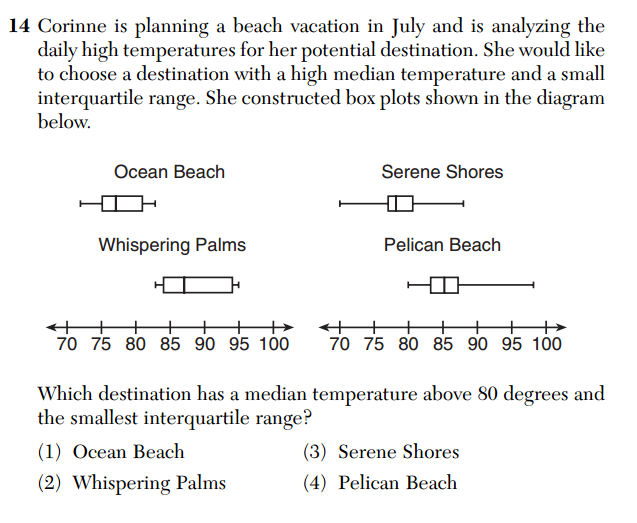
This is question 14 from the Common Core Algebra exam.

January 2015 CC A 14Setting aside the excessive, and questionable, setup (do people really think about minimizing the interquartile range of daily temperatures when choosing vacation spots?), there is a serious issue with this question:  it has no correct answer.

The student is asked to identify the data set that satisfies the following two conditions:  median temperature over 80 and smallest interquartile range.  No data set satisfies both these conditions.  According to the diagram, the data associated with “Serene Shores” has the smallest interquartile range (represented by the width of the “box” in the box-and-whisker plot), but its median temperature (the vertical line segment in the box) is below 80.

The answer key says that (4) is the correct answer, but that data does not have the smallest interquartile range shown.  Presumably, the intent was for students to evaluate a conditional statement, like, “Among those that satisfy condition A, which satisfies condition B?”  But as written, the question asks, “which satisfies both condition A and condition B?”  No set of data satisfies both.

Some may consider this nitpicking, but precision in language is an important part of doing mathematics.  I focus on it in my classroom, and it is frustrating to see my work undermined by the very tests that are now being used to evaluate my job performance.

Moreover, this is by no means the only error present in these exams, nor is it the first example of errors in stating and evaluating compound sentences.  If these exams don’t model exemplary mathematical practice, their credibility in evaluating the mathematical practice of students and teachers must be questioned.

Exploring Correlation and Regression in Desmos

exploring correlationI’ve created an interactive worksheet in Desmos for exploring some basic ideas in correlation and regression.

In the demonstration, four points and their regression line are given.  A fifth point, in red, can be moved around, and changes in the regression line and correlation coefficient can be observed.

The shaded region indicates where the fifth point can be located in order to make (or keep) the correlation among the five points positive.  The boundary of that region was a bit of a surprise to me!

You can access the worksheet here.  Many interesting questions came to mind as I built and played around with this, so perhaps this may be of value to others.  Feel free to use and share!

You can find more of my Desmos-based demonstrations here.

Follow

Get every new post delivered to your Inbox

Join other followers: