The Last Digit of Your Age

Here’s a fun little data set from a statistics textbook I’m reading.
last_digit_of_age_-_1880_vs_1970These are the distributions of last digits of ages reported on the 1880 and 1970 US Censuses.  At least two interesting questions come to mind, one with a seemingly easy answer.

I used Plot.ly to create this simple bar graph, which I shared here.

How Old is the Oldest Person You Know?

The Prudential commercial that aired during Super Bowl 47 features what Steven Strogatz calls the most viewed histogram of all time.

According to the commercial people were asked the age of the oldest person they know, and their answers were plotted.  The resulting histogram is somewhat “normal” looking, and the average age is in the low 90s.

prudential histogram

The commercial’s message is clear:  “Look at how old people get!  You need to be better prepared for your retirement!  Come see a Prudential representative today.”

This is a good example of the subtle ways mathematics can be used to manipulate the opinions of the quantitatively unsophisticated.

The above histogram is intentionally designed to mislead viewers into thinking they may be significantly unprepared for retirement.  The average life expectancy in the US is around 78 years, but this number may not be shocking enough for advertisitng purposes.  So instead of life expectancy, Prudential used age of the oldest person you know, a data set whose average is about 15 years higher.

Showing a histogram that suggests people are likely to live into their 90s might motivate some viewers to head down to their local Prudential office, worried that they aren’t properly prepared for retirement.  But the data on display here isn’t really relevant, and the difference is so subtle that most people won’t notice the distinction.  In reality, the age of the oldest person you know has very little to do with how long you will live.

Imagine asking each member of a large group to name the salary of the highest-paid person they know.  The average of these responses, the average highest-known-salary, will almost certainly be much higher than the average salary of the people in the group.  It would be ridiculous to try to estimate the average salary of the group by looking at the average highest-known-salary, but in a sense, that is exactly what Prudential is doing in this commercial.

The fact that they are doing it intentionally to further their interests provides yet another example of  the vital need for quantitative literacy in today’s world.

NBA Draft Math: Strength of Draft Class

After creating a simple metric to evaluate the success of an NBA draft pick, I realized that the same approach could be used to evaluate the overall strength of a draft class.

To quantify the success of an individual draft pick I’m looking at the total minutes played by a player during the first two years of his contract.  As far as simple evaluations are concerned, I think minutes played is as good a measure as any of a player’s value to a team, and I’m only looking at the first two years as those are the only guaranteed years on a rookie’s contract.  This is by no means a thorough measure of value–it’s meant to be simple while still being relevant.

After using this measure to compare the performance of individual draft picks, I used the same strategy to evaluate the entire “Draft class”.  I computed the average total minutes per player for the entire first round (picks 1 through 30, in most cases) of each draft from 2000 to 2009.  Here are the results.

There doesn’t seem to be much variation among the draft classes, but the 2006 draft certainly looks weak by this measure.  Upon closer inspection, that year does seem like a weak draft:  the best players being LeMarcus Aldridge (2), Brandon Roy (6), and Rajon Rondo (21).  The weakness of the 2000 draft also seems reasonable upon closer inspection at basketball-reference.com.

Another approach would  be to somehow aggregate the career stats of each player in a draft, rather than looking at only the first two years, but that would make it difficult to compare younger and older players.

Are there any other suggestions for rating the overall strength of an NBA draft class?

Related Posts


NBA Draft Math, Part I

Having put some thought into the mathematics of the NFL draft, I decided to turn my attention to basketball.  From an anecdotal perspective, the NBA draft seems to be more hit-or-miss than the NFL draft:  teams occasionally have success and draft a great player, but it seems more common that a draft pick doesn’t achieve success in the league.

In an attempt to quantify the “success” of an NBA draft pick, I researched some data and ending with choosing a very simple data point:  the total minutes played by the draft pick in their first two seasons.

Total minutes played seems like a reasonable measure of the value a player provides a team:  if a player is on the floor, then that player is providing value, and the more time on the floor, the more value.  I looked only at the first two seasons because rookie contracts are guaranteed for two years; after that, the player could be cut although most are re-signed.  In any event, it creates a standard window in which to compare.

There are plenty of shortcomings of this analysis, but I tried to strike a balance between simplicity and relevance with these choices.

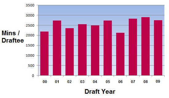
I looked at data from the first round of the NBA draft between 2000 and 2009.  For each pick, I computed their total minutes played in their first two years.  I then found the average total minutes played per pick over those ten drafts.

Not surprisingly, the average total minutes played generally drops as the draft position increases.  If better players are drafted earlier, then they’ll probably play more.  In addition, weaker teams tend to draft higher, and weak teams likely have lots of minutes to give to new players.  A stronger team picks later in the draft, in theory drafts a weaker player, and probably has fewer minutes to offer that player.

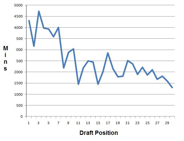
However, when I looked at the standard deviation of the above data, I found something more interesting.  Standard deviation is a measure of dispersion of data:  the higher the deviation, the farther data is from the mean.

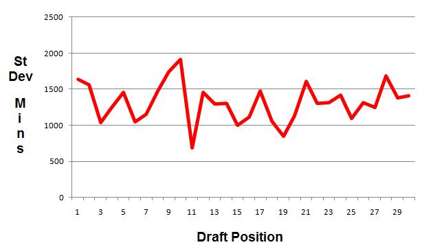
Notice that the deviation, although jagged, seems to bounce around a horizontal line.  In short, the deviation doesn’t decrease as the average (above in blue) decreases.

If the total number of minutes played decreases with draft position, we would expect the data to tighten up a bit around that number.  The fact that it isn’t tightening up suggests that there are lots of lower picks who play big minutes for their teams.  This might be an indication that value in the draft, rather than heavily weighted at the top, is distributed more evenly than one might think

This rudimentary analysis has its shortcomings, to be sure, but it does suggest some interesting questions for further investigation.

Related Posts

Joe Girardi, Probability, and Expected Value

During last night’s Yankees-Twins baseball game, the commentators were discussing the Yankees’ increased use of defensive shifts.

A “shift” is a defensive realignment of the infield to guard against a particular player’s hitting tendencies.  For example, if a player is much more likely to hit the ball to the right side of the infield (as, say, a strong left-handed hitter might be), a team may move an infielder from the left side to the right side to increase the chance of defensive success.

Dramatic infield shifting was once a rarity in the game, employed against only a few hitters in the league.  It is now being used with increasing frequency.  “All the data is out there,” said the announcers when discussing Yankees’ manager Joe Girardi’s explanation of why he was using it more.  (Which sounded remarkably like what Rays’ manager Joe Maddon, a pioneer in increased defensive shifting, had to say when asked about it some time ago).

The essential idea is that, given the reams of data now recorded on player performance, teams have a much more refined understanding of what a player will do.  No longer is the projection “The player has a 30% of getting a hit”; now, it’s “The player pulls 83% of ground balls to the left side of the infield”.  Naturally, teams try to use such information to their advantage.

It’s good that Joe Girardi is demonstrating an increased appreciation for, and understanding of, probability.  But as last night’s game suggests, he may need to learn more about the principle of expected value.

Early in the game, the bases were loaded with two outs, and a left-handed batter came to the plate.  Girardi put the defensive shift on, responding to data on this player that suggested he was extremely likely to ground out to the right side of the infield.  But probability considerations should be only one part of the analysis.  By leaving so much of the left side of the infield undefended, a situation was created where a weakly hit ground ball that would usually be an easy out actually produced two runs for the Twins.

In short, although the probability of that event (ground ball to the left side) was low, the risk (giving up two runs) was high.  Considering both the probability and the payoff is essential to long-term success.

I’d be surprised if the Yankees’ employ the shift again in that situation.  And if the Yankees need a special quantitative consultant, I am available during the summer.

Follow

Get every new post delivered to your Inbox

Join other followers: