Dangerous Numbers

My latest piece for the New York Times Learning Network is inspired by a recent NYT editorial from mathematician and author John Allen Paulos. In “We’re Reading the Coronavirus Numbers Wrong”, Paulos opens with a warning about our addiction to up-to-the-minute:

Numbers have a certain mystique: They seem precise, exact, sometimes even beyond doubt. But outside the field of pure mathematics, this reputation rarely is deserved. And when it comes to the coronavirus epidemic, buying into that can be downright dangerous.

The lesson uses Paulos’s essay to help frame student analysis of new reporting. By asking questions like “Is the data what we think it is?”, “Does the data mean what we think it means?”, and “Is there other data that could help put this in context?”, students can improve their quantitative literacy skills. And maybe spot a few “dangerous numbers” of their own!

The full lesson is freely available at the New York Times Learning Network.

Teaching With the Data of Economic Mobility

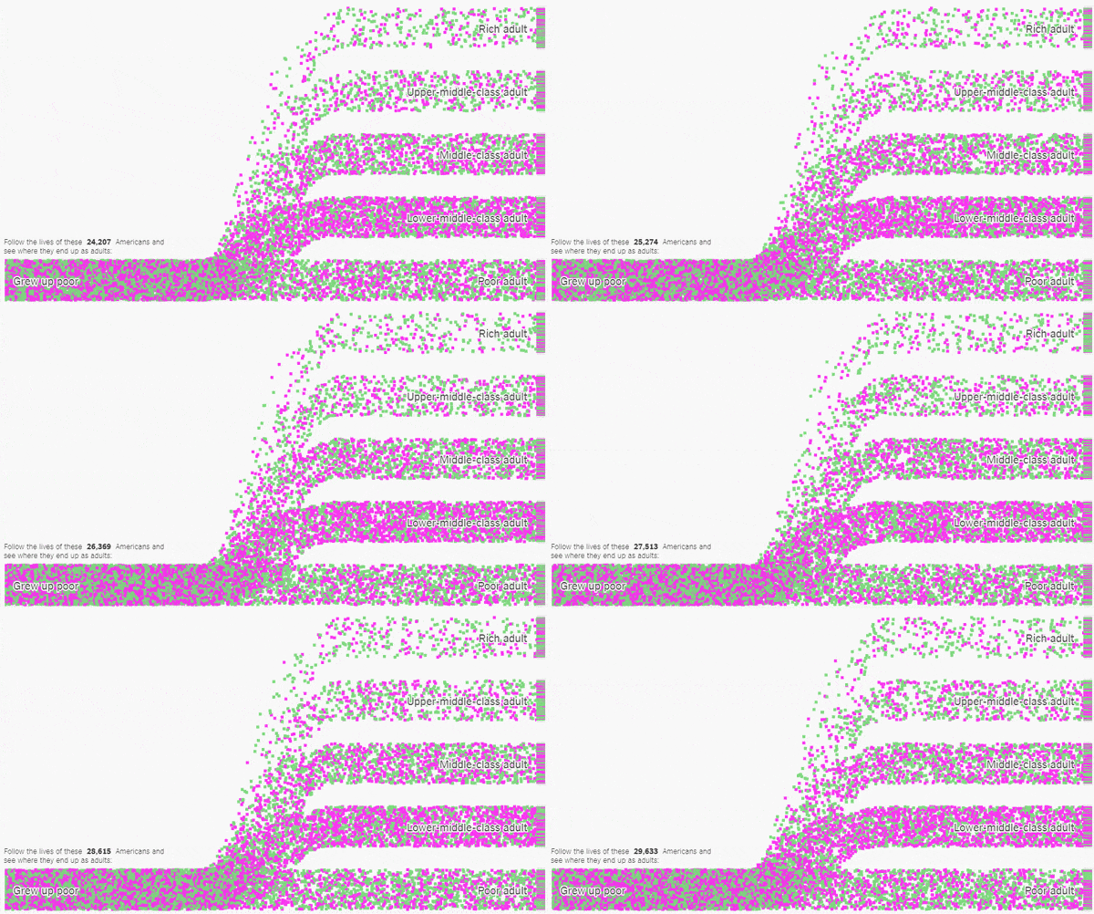
My latest piece for the New York Times Learning Network was inspired by some amazing data visualizations from The Upshot.

These animations show trends in economic mobility gathered from a landmark study of 20 million Americans. In my lesson, students use the Upshot’s customizable tools to collect and analyze data from the study to determine which groups of Americans have the best chance of improving their economic standing.

Here’s the introduction:

America is often referred to as the land of opportunity. But are all opportunities created equal? Do all Americans have the same chance of achieving the American dream?

A groundbreaking study of United States census data examined how the economic status of 20 million Americans changed from childhood to adulthood, and while the data has a lot to tell us about economic opportunity in the United States, it is likely to raise more questions than it answers.

In this lesson, students use tools created by The New York Times to explore data from the study on economic mobility. They will analyze and categorize economic outcomes, compare and contrast statistics for different demographic groups, and pose and explore their own questions about what this data has to say about economic opportunity.

Does everyone in America have the same chance at success? Let’s see what the data says.

The full lesson is freely available here.

NCTM Annual — 2018

I’m excited to be heading to Washington, DC in April for the 2018 NCTM Annual Meeting!

NCTM’s annual meeting brings together thousands of educators from across the country to discuss mathematics, pedagogy, technology, and more. I presented at the 2017 Annual Meeting in San Antonio and had a great time, so I’m looking forward to this year in DC.

I’ll be presenting Statistics and Simulation in Scratch, a 60-minute session about using simple computer programming tools to make the study of probability and statistics more experimental and exploratory. We’ll look at ways teachers and students can use Scratch, the free, web-based programming environment designed by the MIT Media Lab, to model simple probability experiments, collect and analyze data, and create mathematically compelling projects. The technology tools we’ll be using are free and intuitive, and they open up a new pathway to probability and statistics for students and teachers. In addition, it creates opportunities to learn and apply fundamental computer programming skills in a meaningful context.

My talk is scheduled for Thursday, 4/26/18, at 3:00 pm, so if you’re planning on attending the NCTM Annual, please keep my session in mind!

Conferences like this are great opportunities for professional growth, but the logistics are often complicated for classroom teachers.  I’m fortunate to have received support from Math for America, which makes attending NCTM’s Annual Meeting in Washington DC possible. And I’m proud to be one of several MfA teachers presenting at NCTM! You can find a complete list of MfA presenters here.

Related Posts


MfA Workshop — Stats and Sims in Scratch

Tonight I’ll be running a workshop, “Stats and Sims in Scratch”, for teachers at Math for America. In this workshop we will develop basic computational tools for exploring elementary and advanced problems in probability, and implement and apply statistical procedures via programming.

This workshop is a product of my ongoing efforts to integrate mathematics and computer science in my classrooms. The study of probability creates natural opportunities to bring in tools from computer science, which create alternate pathways to understanding concepts in probability through generating, managing, and analyzing data.

I will also be presenting on this topic at the NCTM Annual Meeting in Washington, DC in April of this year. Feel free to contact me for more information about this particular workshop or my other work with mathematics and Scratch.

Related Posts


Teaching with the ASA’s Election Prediction Contest

My latest piece for the NYT Learning Network gets students using statistics and data analysis to create entries for the American Statistical Association‘s Election Prediction contest.

The ASA’s contest invites students to predict the winner of each state in the upcoming Presidential election, as well as the vote-share for each major party candidate.  My piece offers students some basic strategies to consider when making their predictions.

A straightforward strategy for predicting the winner of each state would be to use the latest aggregate polling data from a reputable source. The New York Times offers a state-by-state probabilities chart that provides a projected outcome for each state as determined by each of several media outlets, including The Times itself as well as FiveThirtyEight and Daily Kos, among others.

Students could choose one of the outlets to use as the basis for their predictions, but to satisfy the written requirement of the contest they should be prepared to provide some justification for their choice. For example, they could research each outlet’s methodology and explain why they found one more compelling than another (perhaps more polls are used from each state, or the predictions have been more stable over time).

In addition to introducing students to several basic prediction strategies, there are plenty of links to online resources where students can explore visualizations of voting trends and research historical voting data.  The lesson is freely available here.

The ASA’s contest ends October 24th, so get predicting!

Follow

Get every new post delivered to your Inbox

Join other followers: