Teaching and Social Media: A Small Success

On one of those summer vacation days, full of promise and possibility, I innocently added an item to my To Do list:  start a blog and post something mathematical every day.  I saw it mostly as an intellectual exercise, one that might potentially be of use to some of my students, and I figured I’d just try it out and see where it led.  A productive waste of time, I thought.

Somewhere along the way, I started seeing, and capturing, more and more Math Photos.  Compelled to find math to think and write about, I started seeing more math around me.  People liked the photos, and my camera became a regular companion.  I began thinking more visually, more creatively.  While visiting home, I caught some light slipping through the blinds and snapped a few photos like this:

Light Trapezoid 1

A few days later, I received a message on Twitter from a digital colleague.  Jim Wilder (@wilderlab), a math and science teacher in Alabama, had shown my photos to some of his fourth-grade students.  Inspired, they went around looking for their own quadrilaterals in the shadows.  He shared this photo with me.

wilderlab student shadow

I was truly moved by this small surprise.  With barely an afterthought, I shot and posted that photo.  A fellow teacher saw it, shared it, and it’s now become a mathematical experience for a student I’ve never met.

This is just one small example of how much my professional world has changed through this process.  The impact of social media technologies on teachers and students seems virtually limitless, and it’s exciting to be a part of it in my own small way.

At the very least, it’s a productive waste of time.

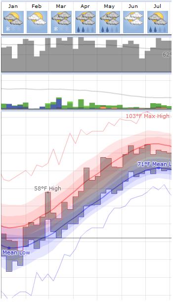
Beautiful Weather Graphs

“Beautiful Weather Graphs and Maps” are promised by WeatherSpark, and they deliver.

You can get local forecasts that show a number of projections bounded by highs and lows, or you can look at daily, monthly, or yearly trends that aggregate historical data.

In another section, a variety of interactive maps allow you to look at geographic trends in temperature, wind, humidity, and many other factors.

You can even look at long-term global temperature data!

A lot of information and representation to interact with and explore here.

NBA Draft Math: Evaluating Team Success

After developing a simple metric for evaluating the success of NBA draft selections, I used that metric to investigate talent dispersion in the draft and then to compare the strength of various “draft classes”.  As a third application of this metric, I will now analyze the success each NBA teamin making their draft picks.

I am using the total number of minutes played in the first two years of a player’s career as the basic quantification of draft pick value (the reasoning for this is explained in detail in NBA Draft Math, Part I).

In order to rate the success of a team, I looked at how each team’s draft pick performed relative to the average player chosen at that draft position for the NBA drafts between 2000 and 2009.  I then computed the percentage difference between that team’s choice and the average player at that pick.  The team’s overall rating is then the average of the percent differences for every draft pick.

The chart below summarizes the analysis for the Philadelphia 76ers.

As you can see, all but one of the 76ers draft choices performed better than the average player selected at that draft position.  Overall, draft picks selected by Philadelphia performed about 34% better than average; they topped the list in this ranking.

This chart displays all NBA teams whose picks performed better than average.  In addition to the 76ers, teams that performed notably well by this measure were the San Antonio Spurs, the Houston Rockets, and (surprisingly?) the New York Knicks.

The teams that performed worst in the analysis were the Boston Celtics, the Portland Trailblazers, and the Charlotte Bobcats.

Some interesting results!  The basic limitations of this metric have been addressed in NBA Draft Math, Part I, but this simple approach has opened up a lot of opportunities for analysis, and naturally, improvement.

Related Posts


Pendulum Wave Animation

Inspired by a video showing the seemingly chaotic movements of pendula of varying lengths, I created this animation in Geogebra.

Using sine functions of varying periods, I was able to create a set of points that oscillate in a manner similar to the pendula in the “Pendulum Waves” video.

Consider the point on the bottom as the timekeeper.  In the the time it takes the bottom point to complete one full trip (from center to right to left back to center), the next point up completes two full trips; the point above that three full trips, and so on.

Since every point is completing a whole number of trips in that amount of time, they will all sync up every time the bottom point is ready to start again.  And watch the “even” points to see when they sync up, too!

Follow

Get every new post delivered to your Inbox

Join other followers: