Visual Representations of World Cup Final Stats
 The NYT’s soccer blog (I can start calling it soccer again, right?) has a nice selection of tools to analyze the stats from yesterday’s World Cup Final:
http://goal.blogs.nytimes.com/2010/07/11/world-cup-live-netherlands-vs-spain/
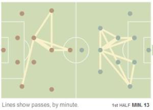
The default is the “Heat Map”, which attempts to show the region of play minute-by-minute. That’s not nearly as interesting to me as the the “Passes” tab, which appears to detail each possession with an undirected graph, connecting two players with an edge if a pass occured between them (How do we know who passed to whom? What if two players passed back-and-forth to each other? Why not indicate turnovers in this manner?). Using a graph like this could certainly help an analyst determine the worth of a player on the field.
There’s also a sidebar that shows various stats from the game. For example, you can see that the seven players with the highest number of “Touches”, and the top eight in “Passes”, were all Spaniards. This supports the general description of their style of play (a lot of passing and waiting, I guess). After looking at those stats for a bit, I couldn’t help but laugh when I pulled up the list for “Goals”.
There’s a lot of statistical analysis here for a game that was tied at zero for two hours.
0 Comments