NYT Presents: Jeterography

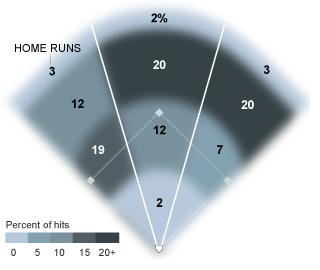
In celebration of Derek Jeter’s 3,000th major league hit, the New York Times ran a really cool infographic displaying the relative frequencies of where those 3,000 hits went.

http://archive.nytimes.com/www.nytimes.com/interactive/2011/06/15/sports/baseball/jeter-3000-hits.html

In addition to tracking where all of Jeter’s hits have gone, two graphics also compare his first 1,500 hits to his second 1,500 hits:  not surprisingly, the second 1,500 consists of fewer home runs and fewer hits to left field.  A similar graphic shows Alex Rodriguez’s hit patterns.

There are several other interesting data displays here, including year-by-year histograms for all 28 MLB players with 3,000 hits.

Analysis of NBA Finances

This is a comprehensive and insightful look into the NBA’s claims of financial distress from Nate Silver:

https://fivethirtyeight.blogs.nytimes.com/2011/07/05/calling-foul-on-n-b-a-s-claims-of-financial-distress/

As the NBA prepares to battle the player’s union over revenue, the league has made several public claims about how they have been losing money for years.

Silver takes a deep look into those claims.  He crunches the numbers and compares player revenue as a share of league revenue across the four major sports leagues; he looks at salary growth relative to league growth; and he also discusses some of the dubious accounting tricks teams and leagues use to make profits disappear!

As usual from Nate Silver, this is a very interesting and readable application of mathematics and statistics.  His conclusion is summed up best by a recent message from @fivethirtyeight on Twitter:  “If David Stern really thinks the NBA lost $370 million last season, shouldn’t he have fired himself?”

NBA Draft Math: Evaluating Team Success

After developing a simple metric for evaluating the success of NBA draft selections, I used that metric to investigate talent dispersion in the draft and then to compare the strength of various “draft classes”.  As a third application of this metric, I will now analyze the success each NBA teamin making their draft picks.

I am using the total number of minutes played in the first two years of a player’s career as the basic quantification of draft pick value (the reasoning for this is explained in detail in NBA Draft Math, Part I).

In order to rate the success of a team, I looked at how each team’s draft pick performed relative to the average player chosen at that draft position for the NBA drafts between 2000 and 2009.  I then computed the percentage difference between that team’s choice and the average player at that pick.  The team’s overall rating is then the average of the percent differences for every draft pick.

The chart below summarizes the analysis for the Philadelphia 76ers.

As you can see, all but one of the 76ers draft choices performed better than the average player selected at that draft position.  Overall, draft picks selected by Philadelphia performed about 34% better than average; they topped the list in this ranking.

This chart displays all NBA teams whose picks performed better than average.  In addition to the 76ers, teams that performed notably well by this measure were the San Antonio Spurs, the Houston Rockets, and (surprisingly?) the New York Knicks.

The teams that performed worst in the analysis were the Boston Celtics, the Portland Trailblazers, and the Charlotte Bobcats.

Some interesting results!  The basic limitations of this metric have been addressed in NBA Draft Math, Part I, but this simple approach has opened up a lot of opportunities for analysis, and naturally, improvement.

Related Posts
 

Rating the Ballparks

baseball-stadium-rankingsIn an attempt to rate the various Major League Baseball stadiums around the country, Nate Silver looked at the user ratings from online review site Yelp.  Noting that every ballpark has at least several hundred user reviews, Silver compiled the data from Yelp’s 1 to 5 rating system to create an ordering of the stadiums.  Once complete, the list creates a natural starting point to investigate questions like “Is ballpark satisfaction correlated with team performance?” and “How valuable is a retractable-roof stadium?”

Silver also provides the standard deviation for the ratings for each ballpark and explains the significance.  Standard deviation is a measure of the dispersion of data, so a higher deviation means more extreme ratings.

A great, fun little project!  What else can we rate using available user ratings?

Read the full article here.

Follow

Get every new post delivered to your Inbox

Join other followers: