Birthday Frequency Visualization
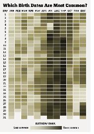
 This is a beautiful visualization of birthday frequency:
http://gizmodo.com/5910773/how-common-is-your-birthday
This “heat map” shows which days are the most common birthdays in the U.S.
Lost of interesting questions arise from this representation of data. We can immediately see that July, August, and September seem to form a disproportionate band of birthdays. And take a look at July 4th: what’s the explanation for that?
In addition, you could also use this chart to create some new twists on the classic birthday paradox!
2 Comments
Paul Gitchos · October 17, 2012 at 10:52 am
Because many births are scheduled and induced, weekday birthdays are more common. I think this would also explain the July 4 and Christmas holidays showing up on the chart.
December 28 has always felt like an uncommon birthday to me, but now I know it’s much more common than the 26th.
I really appreciate your blog. Thanks!
MrHonner · October 17, 2012 at 1:48 pm
Hi Paul-
I think you’re right about scheduled births having a great influence on the dispersion of birthdays. Knowing what percentage of births were scheduledm, that is un-(?) or pseudo-(?) random, would help in this analysis. I wonder how high that percentage would have to be to impact the “random” distribution in general.
Thanks for stopping by–and thanks for the kind words.