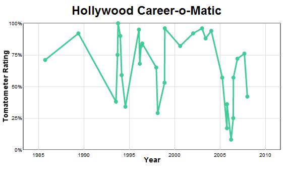
 This is a cool collection of data analysis from Slate.com that uses scores from the movie review site RottenTomatoes.com to chart the careers of actors and directors.
http://www.slate.com/id/2296070/
In addition to comparing the average career trajectories of actors and directors (a curious result!) and provoking interesting questions like “Why does the average rating seem to be falling over time?”, Slate provides a great little toy to play with: the Hollywood Career-o-Matic.
Type the name of any actor or director into the Career-o-Matic and see a quantitative overview of that person’s film history graphed out in front of you! You can even type multiple names and compare graphs! Scrolls over the highs (and lows) to get film details.
A nice little data tool, and it’s easy to see some fun, informal data projects coming from this. And it looks like it all started with this brilliant critique of M. Night Shyamalan.
 Here’s another nice collection of free e-books on a wide range of topics.