Pricing Models

This is an interesting article about variations on the pay-what-you-wish pricing model that has gained some attention in the last few years.

https://www.discovermagazine.com/planet-earth/caring-with-cash-or-how-radiohead-could-have-made-more-money

The band Radiohead famously offered their album “In Rainbows” on their website and asked fans to pay whatever they wanted for the download.  The actual sales numbers are well-guarded, but  it appears to have been a success.

The above article details how an amusement park merged the pay-what-you-want approach with a half-goes-to-charity approach (telling the customer that half of the purchase price is donated to charity).  The product in question was a picture of the customer riding a roller coaster.  Let’s abbreviate with PWYW (Pay What You Wish), HGTC (Half Goes to Charity), and PWWTY (pay-what-we-tell-you):

Percent Sales Average Sale Price
PWWTY .5% $12.95
PWWTY & HGTC .57% $12.95
PWYW 8.4% $0.92
PWYW & HGTC 4.5% $5.33

When given the opportunity to pay whatever they wanted, participation increased dramatically, but revenue was still low–only 92 cents per person.  But when combined with the half-goes-to-charity approach, participation was much higher and the price paid was significantly higher.  Even after taking out the half for charity, revenue was still up by a factor of three!

This is a very interesting approach to pricing, and there are some cool psychological and sociological principles at work here.  And it’s another set of factors to consider when that salesperson is working on you.
Yet Another Way to Lie With Statistics

This is a nice takedown of some spurious economic analysis, courtesy of Freakonomics:

http://www.freakonomics.com/2011/03/30/how-to-spot-advocacy-science-john-taylor-edition/

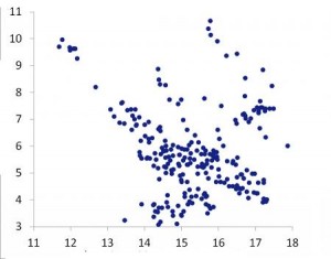
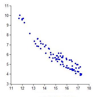
Looking at the graph at the right, it’s hard not notice the negative correlation between the two given variables, and the economist in question uses that correlation to bolster his policy argument.

The graph looks a lot different, however, when you look at all the available data, not just the data between today and the arbitrarily chosen cut-off of 1990.  But that chart doesn’t support the argument as decisively.

As the author suggests, “Be wary of economists wielding short samples.”

Math and the Music Industry

NPR ran an interesting article about how much it costs to make a hit pop song.

Using a Rhianna song as an example, this article breaks down the approximate costs for songwriters, producers, engineering, and marketing.

Before reading the article, take a guess as to how much of the money spent on making a “hit” song goes to creative artists:  you’ll almost certainly be surprised.

Math Lesson: Analyzing Economic Measures in a Downturn

My latest contribution to the New York Times Learning Network is a math lesson built around gathering, representing, and analyzing economic indicator data.

https://learning.blogs.nytimes.com/2011/09/28/nowhere-to-go-but-up-analyzing-economic-measures-in-a-downturn/

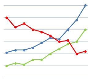
By getting data on Real G.D.P., personal income, corporate profits, and unemployment from official sources like the Bureau of Economic Analysis and the U.S. Department of Labor, students explore positive and negative correlations between the various economic indicators.

In addition, students can explore the relationships between graphs of quantities and their rates of change by creating and comparing graphs of percent change.

What Costs More in 2011?

This is a nice representation of Consumer Price Index data from the outstanding FlowingData.com:

What costs more in 2011?

Charting the change in prices from March 2010 to March 2011, transportation and education prices went up the most, while communication and apparel dropped a bit.  A nice feature of this infographic is that it includes inflation as a benchmark; it’s easy to see here that even though food prices increased, their increase was consistent with inflation overall.

The creator of this infographic wonders why the government itself doesn’t do what FlowingData.com does:  namely, why doesn’t the Bureau of Labor Statistics create simple, easy-to-understand graphics like this with its data, rather than just publishing a text file full of numbers every month?

That’s a good question, and a good opportunity to get students involved!  Making data easier to understand means making data more useful, so take a look at the Bureau of Labor Statistics (http://www.bls.gov/), the Center for Disease Control (http://www.cdc.gov/), or some other government agency.  Grab some public data, create some visual representations, and make the data understandable!  And use FlowingData’s great work here, and elsewhere, as a guide.

Follow

Get every new post delivered to your Inbox

Join other followers: