Yet Another Way to Lie With Statistics
 This is a nice takedown of some spurious economic analysis, courtesy of Freakonomics:
http://www.freakonomics.com/2011/03/30/how-to-spot-advocacy-science-john-taylor-edition/
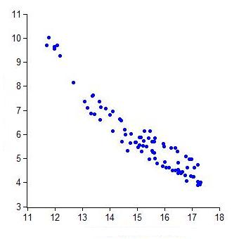
Looking at the graph at the right, it’s hard not notice the negative correlation between the two given variables, and the economist in question uses that correlation to bolster his policy argument.
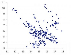
The graph looks a lot different, however, when you look at all the available data, not just the data between today and the arbitrarily chosen cut-off of 1990. But that chart doesn’t support the argument as decisively.
As the author suggests, “Be wary of economists wielding short samples.”

0 Comments