Here is another installment in my series reviewing the NY State Regents exams in mathematics.
One of the biggest differences between the new Common Core Regents exams and the old Regents exams in New York state are the conversion charts that turn raw scores into “scaled” scores.
The conversions for the new Common Core exams make it substantially more difficult for students to earn good scores. The changes are particularly noticeable at the high end, where the notion of “Mastery” on New York’s state exams has been dramatically redefined.
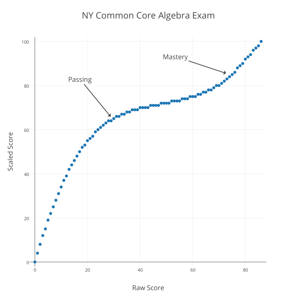
Below is a graph showing raw versus scaled scores for the 2015 Common Core Algebra Regents exam.
As with last year’s Common Core Algebra Regents exam, there is a remarkable contrast between “Passing” and “Mastery” scores. To pass this exam (a 65 “scaled” score), a student must earn a raw score of 30 out of 86 (35%); to earn a “Mastery” score on this exam (an 85 “scaled” score), a student must earn a raw score of 75 out of 86 (87%). It seems clear that the new conversions are designed to reduce the number of “Mastery” scores on these exams.
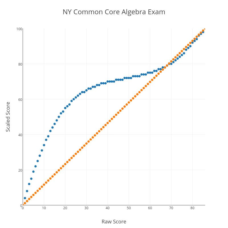
Another curious feature of this conversion chart is what happens at the upper end. Consider the graph below, which shows the CC Algebra raw vs. scaled score in blue and a straight-percentage conversion (87% correct “scales” to an 87, for example) in orange.
At the very high end, the blue conversion curve dips below the orange straight-percentage curve. This means that, above a certain threshold, there is a negative curve for this exam! For example, a student with a raw score of 82 has earned 95% of the available points, but actually receives a scaled score of less than 95 (a 94, in this case). I suspect there are people who will claim expertise in these matters and argue that this makes sense for some reason, but it certainly doesn’t make common sense.
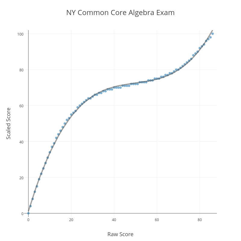
One final curiosity about this conversion. It’s no accident that the blue plot of raw vs. scaled scores looks like a cubic function.
Running a cubic regression on the (raw score, scaled score) pairs yields
That is a remarkably strong correlation. Clearly, those responsible for creating this conversion began with the assumption that the conversion should be modeled by a cubic function. What is the justification for such an assumption? It’s hard to believe this is anything but an arbitrary choice, made to produce the kinds of outcomes the testers know they want to see before the test is even administered.
These conversion charts are just one of many subtle ways these tests and their results can be manipulated. Jonathan Halabi has detailed the recent history of such manipulations in a series of posts at his blog. These are the kinds of things we should keep in mind when tests are described as objective measures of student learning.
Related Posts
- Regents Recaps
- Regents Recap — June 2016: Scale Maintenance
- Regents Recap — June 2014: Common Core Scoring
