Dancing Bubble Sort

This is a fun and whimsical demonstration of bubble sorting through dance!

http://www.youtube.com/watch?v=lyZQPjUT5B4

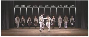
The dancers arrange themselves in numerical order in the same manner one would bubble sort an unordered list.  One by one, each number “compares” himself with the number on his left; if they are out of order, they switch places.  Make you’re way down the list, and start again at the front.  Repeat until no one switches places and voila! everyone’s in order!

bubble sort dance

And just to be thorough, the troupe does dance-representations of Insert-Sort,  Shell-Sort, and Select-Sort algorithms as well!
America By the Numbers

NYT us by the numbersThis is a nice infographic from the NYT highlighting some of the data from the 2010 U.S. Census:

http://www.nytimes.com/interactive/2011/01/07/us/CENSUS.html

Some of the highlights

  • We’re eating less meat and fewer vegetables per person per year, down 5.4 lbs and 30 lbs, respectively, since 2000.  One wonders where we are making up the difference?
  • The marriage rate is the lowest since 1970, and the divorce rate is comparable to that year’s, as well.

The accompanying article from the Times can be found here, and the U.S. Census Bureau’s Statistical Abstract of the United States, where this summary information is drawn from, can be found here.

Data Visualization

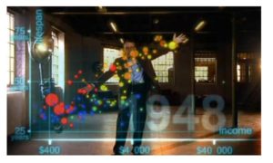
spiffier roslingThis is a fancier version of a well-known Hans Rosling video showing correlations between life-expectancy and income across time periods and geographical regions.

http://www.youtube.com/watch?v=jbkSRLYSojo

It’s truly a beautiful representation, and it really helps make sense of a large set of multi-dimensional data.

The original version is a bit more academic in feel, but you can’t blame Rosling for going a little Hollywood here.

Facebook Formulas

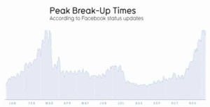
peak breakup timesThis graph on the right represents break ups per day, as determined by an analysis of Facebook status changes.  The data suggests that break-ups seem to occur most frequently in mid-February and late November.

Drawing conclusions from data is always dicey, and there are probably a lot of holes to poke in the methodology here, but it certainly is fun trying to attach meaning to these numbers!

This graph was featured in a TED Talk given by David McCandless, who runs the wonderful website www.informationisbeautiful.net.

The whole talk can be found here; this chart comes up at around the 6:50 mark.

The amount of data available through social networking sites is mindblowing, and it can’t be long before it will be used in some significant way.  Indeed, a group of MIT students has already devised a system, cleverly titled Project Gaydar, that, with some accuracy, identifies the sexual orientation of a Facebook user based on friends, likes, and other connections.

What will they compute about us next?

Computer Modeling of Gulf Oil Dispersion

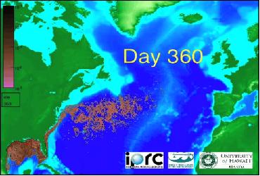
oil spill modelThis is an interesting computer simulation of the potential spread of the gulf oil disaster throughout the Caribbean and Atlantic:

http://www.youtube.com/watch?v=nAiG-TPYIFM

This reminds me of weather-prediction models:  input some initial conditions, set up the propagation rules, and then iterate, iterate, iterate.  Of course, modeling the mathematics of the initial conditions and the propagation rules is a huge challenge.

Follow

Get every new post delivered to your Inbox

Join other followers: