Data Visualization
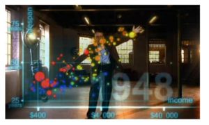
 This is a fancier version of a well-known Hans Rosling video showing correlations between life-expectancy and income across time periods and geographical regions.
http://www.youtube.com/watch?v=jbkSRLYSojo
It’s truly a beautiful representation, and it really helps make sense of a large set of multi-dimensional data.
The original version is a bit more academic in feel, but you can’t blame Rosling for going a little Hollywood here.
0 Comments