Graphing the Collatz Conjecture

This a beautiful representation of the infamous Collatz Conjecture:

http://www.jasondavies.com/collatz-graph/

The Collatz conjecture is one of the great unsolved mathematical puzzles of our time, and this is a wonderful, dynamic representation of its essential nature.

One compelling aspect of the Collatz conjecture is that it’s so easy to understand and play around with.   Start by choosing any positive integer, and then apply the following steps.

Step 1)  If the number is even, cut it in half; if the number is odd, multiply it by 3 and add 1

Step 2)  Take your new number and repeat Step 1.

For example, starting with 10 yields the sequence

10 \longrightarrow 5 \longrightarrow 16 \longrightarrow 8 \longrightarrow 4 \longrightarrow 2 \longrightarrow 1 \longrightarrow 4 \longrightarrow 2 \longrightarrow 1 \longrightarrow ...

The Collatz conjecture simply hypothesizes that no matter what number you start with, you’ll always end up in the 4 \longrightarrow 2 \longrightarrow 1 loop.

Have fun!

Google Public Data Explorer

Google’s Public Data Explorer is a great, free resource for students and teachers interested in data science and statistics.

http://www.google.com/publicdata/home

The site allows you to create custom graphs of available data sets, making it easy to experiment with different representations and explore the meaning of data.

There are several data sets available to play around with.   The OECD Factbook alone provides a wealth of raw data on education, energy, employment, population and migration, and many other categories.  There are also data sets available from the U.S. Census and the U.S. Bureau of Economic Analysis.  There appears to be support for using your own data sets, as well.

The data can be represented in a variety of ways:  histograms, line graphs, and even dynamic time series are all available.  It’s a great way to play around with data, and to build skill and intuition in data analysis, interpretation, and representation.

Bike Data Visualization

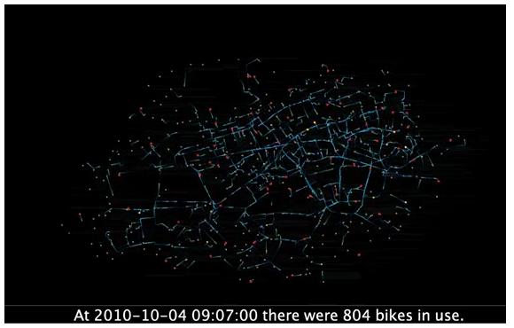
This is a cool visualization of bicycle usage in London:

http://www.digitalurban.org/2011/02/london-cycle-flows-sociable-physics.html

On October 4th, 2010, there was a public transit strike in London, which maximized bike usage in the city.

The creators claim that the flashes of light that represent the bikes move in accordance with the actual speed and path of the bikes they represent.

An innovative representation that puts me in mind of graph theory and networking!

Applications of Government Data

This is a nice resource from The Guardian that highlights some of the ways developers are making government data accessible to citizens.

http://goo.gl/00jmo

The projects include housing price analysis, roadway usage, government spending, and aggregation of community information.

The site wheredoesmymoneygo.org is especially interesting:  slide the bar to your yearly income, and see just how much of your salary is spent on education, health services, defense, and other categories.

Lots of applications to play around with, and plenty of food for thought!

Follow

Get every new post delivered to your Inbox

Join other followers: