Visual Representation of Data
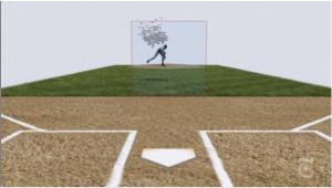
 A friend claimed that this video about Mariano Rivera contained the best info-graphic ever made, and it’s hard to argue.
The whole thing is fascinating, but at about the 1:40 mark the 1300 hundred or so pitches Rivera threw in 2009 are tracked from the mound and plotted in the strike zone. Not only is it a supremely cool visualization of statistical analysis, but it absolutely helps explain why Rivera is so successful (and, indeed, one of the greatest pitchers in baseball history).
2 Comments
Sam Kolins · July 7, 2010 at 5:12 pm
I have to admit, when those 1300 or so balls came flying toward the plate from the catcher’s view, I laughed a little. What a nightmare!
Baseball, in my opinion, is probably one of the best physics oriented sports. Unlike something like basketball or sometimes soccer, it’s not so much strategy-based as it is physics-based. At least, for the pitcher. I’m sure the same argument holds water for other positions too though, most notably the batter and the runner. Tennis falls in a similar vein, only it’s more fast-paced.
Mo Schmo · July 9, 2010 at 11:14 am
The ending gave me a good idea of what it would be like to be killed by a malfunctioning batting cage machine.