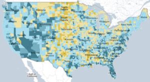
2010 Census Map
 This is another beautiful infographic from the New York Times that allows the user to interact with data from the 2010 U.S. Census.
http://projects.nytimes.com/census/2010/map
You can explore changes in population, density, distribution, and housing by looking at states and counties across the country.
0 Comments