Aftermath — Steven Strogatz on Math Education

strogatz smallAs part of our conversation in the February 2014 issue of Math Horizons, Steven Strogatz shared his thoughts on the current state of math education in the Aftermath section of the magazine.

Here’s the beginning of his “I have a dream” speech about math teaching.

In my dream world, everyone would have the chance to be a teacher the way Mr. Joffray [Strogatz’s high school calculus teacher and the subject of his book The Calculus of Friendship] was a teacher.

His job was to teach us calculus, but he had his own vision of how to teach it and he followed that vision. He was creative, and he put his personal stamp on the course for us. He trusted his judgment, and the school trusted him. He could teach us the way he wanted to teach us, and he was a great teacher.

Math Horizons makes Aftermath freely available online, so you can read the entire segment here.

Teaching Math Using the Olympics

sochi olympicsThe New York Times Learning Network has put together a great collection of ideas to help teachers of all disciplines bring the Sochi Winter Olympics into the classroom.  I contributed to the math section.

For example, using this beautiful infographic showing the medal counts by country for all previous winter olympics, students can explore how countries perform when they host the games.

Use the medal counts to investigate the Olympic “home field advantage.” For each country that has hosted the winter Olympics, calculate the average number of medals it wins when hosting the games and when it does not. Do the host nations tend to win more medals? Do they win more gold medals in particular?

There are many other great ideas for teaching math, science and health here.  A separate set of ideas covering history, geography, and social studies can be found here.

A Conversation with Steven Strogatz in Math Horizons

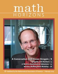
MH Strogatz CoverI was excited to receive this month’s issue of Math Horizons, published by the Mathematical Association of America, which features my interview with Steven Strogatz!

Professor Strogatz and I had a lively and wide-ranging conversation about mathematics, teaching, writing, and the state of math education.  He is an engaging, curious, and open person, and I think all of that comes through in the interview.

Our conversation was so wide-ranging, in fact, that the interview occupies four pages in the magazine, the Aftermath editorial section at the end of the issue, and a few pages at the Math Horizons blog!

It was a personal honor, both to interview Professor Strogatz in an official capacity, and to be published in the MAA’s Math Horizons.

You can read a sample of our conversation here.  And get your copy of Math Horizons for the full interview!

Fun With One Cut!

At the 2013 TIME 2000 conference, I ran a workshop on mathematical folding called Fun With One Cut!  Here are a few of the introductory slides.

Fun With One Cut PresentationIn the workshop, students explored some basic properties of plane geometry through folding and tried their hands at the infamous fold-and-cut challenge:  given a plane figure drawn on  a piece of paper, is it possible to fold the piece of paper in such a way that the figure can be removed from the paper with a single, straight cut?

This is a fun, hands-on mathematical activity, and is connected to some surprisingly deep and rich results in both geometry and mathematical origami.

You can download the set of templates I used for this workshop here, and you can find more of my mathematical folding resources here.

Using Infographics to Teach Math

infographicsMy latest contribution to the New York Times Learning Network is a collection of ideas for using inforgraphics to explore mathematical concepts.

One activity has students look for ways in which graphs and graphics can be used to tell a particular side of a story.

Browse The Times with a critical eye. Think about the side of the story a given graph is being used to tell, and investigate how issues of interval and scale affect how the information is conveyed.  For example, in this Economix post, a graph is being used to show that unemployment is trending at a particular value, but the same graph with a different time interval makes the trend seem a little less significant.

The Times is full of beautiful representations of information, which create great opportunties for quantitative exploration, anaylsis, and discussion.  For more ideas, you can read the entire piece here.

Follow

Get every new post delivered to your Inbox

Join other followers: