Using Infographics to Teach Math
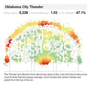
 My latest contribution to the New York Times Learning Network is a collection of ideas for using inforgraphics to explore mathematical concepts.
One activity has students look for ways in which graphs and graphics can be used to tell a particular side of a story.
Browse The Times with a critical eye. Think about the side of the story a given graph is being used to tell, and investigate how issues of interval and scale affect how the information is conveyed. For example, in this Economix post, a graph is being used to show that unemployment is trending at a particular value, but the same graph with a different time interval makes the trend seem a little less significant.
The Times is full of beautiful representations of information, which create great opportunties for quantitative exploration, anaylsis, and discussion. For more ideas, you can read the entire piece here.
0 Comments