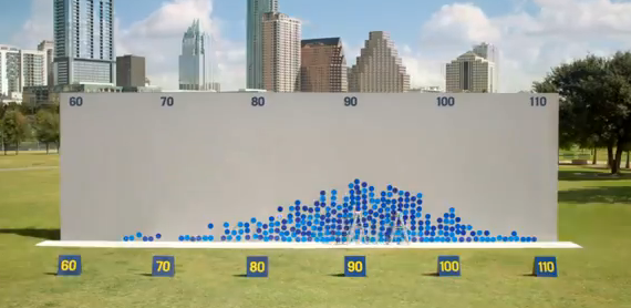
The Prudential commercial that aired during Super Bowl 47 features what Steven Strogatz calls the most viewed histogram of all time.
According to the commercial people were asked the age of the oldest person they know, and their answers were plotted. The resulting histogram is somewhat “normal” looking, and the average age is in the low 90s.
The commercial’s message is clear: “Look at how old people get! You need to be better prepared for your retirement! Come see a Prudential representative today.”
This is a good example of the subtle ways mathematics can be used to manipulate the opinions of the quantitatively unsophisticated.
The above histogram is intentionally designed to mislead viewers into thinking they may be significantly unprepared for retirement. The average life expectancy in the US is around 78 years, but this number may not be shocking enough for advertisitng purposes. So instead of life expectancy, Prudential used age of the oldest person you know, a data set whose average is about 15 years higher.
Showing a histogram that suggests people are likely to live into their 90s might motivate some viewers to head down to their local Prudential office, worried that they aren’t properly prepared for retirement. But the data on display here isn’t really relevant, and the difference is so subtle that most people won’t notice the distinction. In reality, the age of the oldest person you know has very little to do with how long you will live.
Imagine asking each member of a large group to name the salary of the highest-paid person they know. The average of these responses, the average highest-known-salary, will almost certainly be much higher than the average salary of the people in the group. It would be ridiculous to try to estimate the average salary of the group by looking at the average highest-known-salary, but in a sense, that is exactly what Prudential is doing in this commercial.
The fact that they are doing it intentionally to further their interests provides yet another example of the vital need for quantitative literacy in today’s world.


