I love this simple piece of public art in Portugal. We all need occasions to be reminded of the beauty of circles.
What Costs More in 2011?
This is a nice representation of Consumer Price Index data from the outstanding FlowingData.com:
Charting the change in prices from March 2010 to March 2011, transportation and education prices went up the most, while communication and apparel dropped a bit. A nice feature of this infographic is that it includes inflation as a benchmark; it’s easy to see here that even though food prices increased, their increase was consistent with inflation overall.
The creator of this infographic wonders why the government itself doesn’t do what FlowingData.com does: namely, why doesn’t the Bureau of Labor Statistics create simple, easy-to-understand graphics like this with its data, rather than just publishing a text file full of numbers every month?
That’s a good question, and a good opportunity to get students involved! Making data easier to understand means making data more useful, so take a look at the Bureau of Labor Statistics (http://www.bls.gov/), the Center for Disease Control (http://www.cdc.gov/), or some other government agency. Grab some public data, create some visual representations, and make the data understandable! And use FlowingData’s great work here, and elsewhere, as a guide.
Math Art: Space-Filling Cube
I hope I don’t offend the artist, Henry Segerman, by identifying his work with an infamous Star Trek enemy, but this cube looks like a Borg ship.
This piece was on display at the 2011 Bridges Math and Art Conference in Coimbra, Portugal.
Are These Tests Any Good? Part 1
The test is a staple of modern education, and not just at the classroom level. Today, tests can determine which public schools a child can attend, whether or not a student graduates, which districts get state aid, and of course, which colleges might want you.
There is a movement afoot which seeks to legally tie teacher job performance to student test scores. There’s a simple argument at the core of this movement (“If students are doing poorly on tests, then the teacher must be doing a poor job”), and a simple counterargument (“There many factors beyond a teacher’s influence that affect student test performance”), but it’s a complex issue, and it has generated much controversy.
As the debate rages on in educational, political, and media circles, one particular aspect of this issue rarely gets discussed: test quality. If the tests being used to evaluate students, schools, and now teachers, are ill-conceived, sloppy, and erroneous, how legitimate a measure of teaching and learning could they possibly be?
In short, few people connected to this issue seem interested in the rather important question “Are these tests any good?”
I will address this question in a series of posts that examine the New York State Math Regents Exams. I’ll begin this series by looking at three questions from the multiple choice section of the 2011 Algebra II and Trigonometry exam. The official test and scoring guide can be found here.
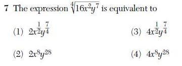
First, an algebra question: which answer is equivalent to the given expression?
The “correct” answer, according to the scoring guide, is (1). However the real answer is that none of these are equivalent to the original expression. For two expressions to be equivalent, they must agree for every possible value of their variables. Let x = -1 and y = 1; the original expression evaluates to 2; the “correct” answer evaluates to undefined(or, if you prefer, to 2i). The two expressions, therefore, are not equivalent.
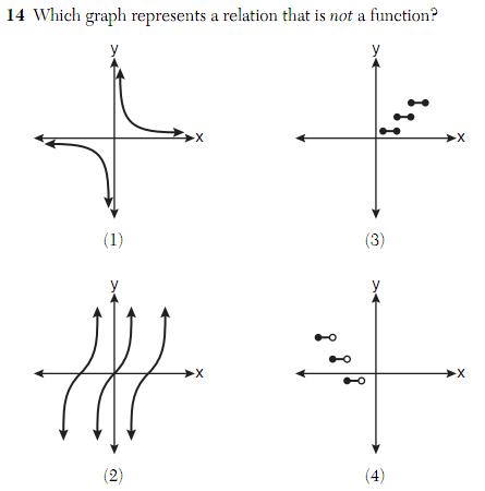
Now consider this question about graphs: which graph is not a function?
 A simple way to determine if a graph is the graph of a function is to use the vertical line test: if a vertical line can be drawn through the graph so that it intersects the graph more than once, then the graph is not the graph of a function. The “correct” answer according to the scoring guide, is (3), which is indeed not a function. But take a closer look at (2):
 As the red vertical lines suggest, this graph also appears to fail the vertical line test. Therefore it is not a function. This question has two correct answers, only one of which was awarded credit.
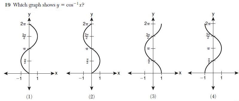
Lastly, consider this question, again about graphs.
 As it turns out, none of these graphs is the graph of
 . The graph in (3), the “correct” answer, is only part of the correct graph. It is not the entire graph. The actual graph of
extends infinitely up and down. (If you feel that the notation
implies a restriction, note that none of these restrictions are correct, either).
While it may seem that some of the issues raised here are merely technicalities, keep in mind that technicalities play an important role in mathematics. Furthermore, students who truly understand the relevant issues here might actually be at a disadvantage on these questions, wasting time sorting through these poorly-conceived problems and worrying about which answer to give.
A lot could be riding on this test: student graduations, teacher jobs, schools closings. With the stakes so high for so many, it seems like we should be paying closer attention to the question: Are these tests any good?
Un-Random Shufflers
This is a great story about how statisticians at Stanford audited a new automatic shuffling machine and determined that the cards weren’t distributed randomly enough.
https://www.newscientist.com/blogs/onepercent/2011/07/shuffling.html
If a deck of cards is dealt one at a time, a knowledgeable observer, in theory, should be able to predict the next card dealt around 4.5 times per 52-card deck. For example, by remembering which cards have been dealt, the observer will definitely know the final card, as it’s the only one that hasn’t been dealt. Similarly, the observer will have a 1 in 2 chance of guessing the second-to-last card, and so on. Calculations involving probability and expected value will give you the theoretical result.
For this particular shuffler, however, the statisticians from Stanford determined that an observer should be able to predict the next card 9.5 times per 52-card deck! The shuffling machine manufacturer that hired them must have been pretty upset to hear this, but redesigning the machine is probably not as costly as selling casinos hundreds of predictable shufflers and then dealing with the consequences.
It should come as no surprise that Persi Diaconis is the lead author on the paper. Diaconis is a living legend in the world of mathematics, having left home at an early age to become a sleight-of-hand artist, then returning to earn a PhD from Harvard in mathematical probability. One of Diaconis first major results was proving that seven shuffles are necessary to “randomize” a standard 52-card deck.
The full paper from Stanford can be found here:
http://statistics.stanford.edu/~ckirby/techreports/GEN/2011/2011-08.pdf


