Wind Map
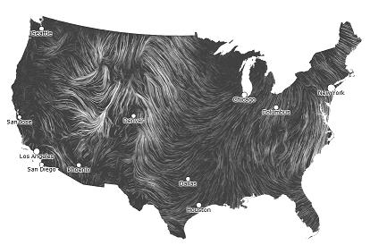
 This is a stunningly beautiful visualization of wind patterns in the US:
Not only is this a functional and immediately accessible representation of data, but it also brings to life the mathematical concepts of vector fields and flow lines.
Apart from atmospheric science questions like “Why is this area windier than others?” are purely mathematical questions like “Which location is the calmest?” and “Which location is most volatile?”
And if you enjoy this, be sure to check out this visualization of the world’s ocean currents!
0 Comments