Cool Representations of Data
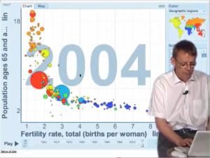
 This is an awesome demonstration of world-wide trends in life expectancy by Hans Rosling. The graph uses regions of changing size, location, and color to show the dynamic history of the data.
http://www.youtube.com/watch?v=QHCt6PmSs0k
I happened upon this here, where there is much more appreciation of Rosling, the “zen master of presenting data”, and his work.
0 Comments