My colleague, Scott Matthews, offered a very elegant solution to the Coffee and Cream mixture problem in response to the straight-forward solution I put forward. As he commented:
In the end, both cups have the same amount of liquid. Therefore, by the simple law of displacement, the amount of cream in the coffee is the the same as the amount of coffee in the cream.
This is a really nice way to think about the problem. In the end, the “coffee” cup contains the same amount of liquid as it started with. Therefore, any cream that ends up in the “coffee” cup had to displace some coffee.
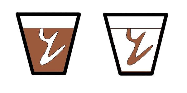
Where did that coffee go? It ended up in the “cream” cup! Here’s a visual interpretation.
Thanks, Scott, for the elegant solution!
Related Posts


