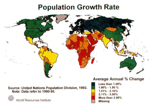
 My latest contribution to the New York Times Learning Network is a math lesson designed to get students thinking quantitatively about the increase in population growth around the world. Here is an excerpt.
A typical feature of population growth is that the rate of increase itself increases over time. Visually, this means that the line segments get steeper from left to right. When the slopes of each line segment are computed for each 10-year interval, students can look for a pattern in how the slopes, i.e. the rates of population growth, change. For example, students might notice that, every ten years, the slope of the line segments increase by 0.5 million people per year: this means that the rate of change of population increases by 0.5 million people per year.
Once a pattern is identified, students can then extend their graph beyond 2010 by drawing a line segment from the 2010 data point whose slope fits this pattern. By extending this new line segment so that it covers 10 years on the horizontal axis, this will create a population projection for the year 2020. By repeating the process, students can create population projections for 2030, 2040 and beyond.
Using a recent revision on world population growth by the United Nations population bureau as a starting point, students choose a country to profile. By using available population data, students create piece-wise linear graphs to model that countries population growth, and look for trends in order to make population projections.
You can find the full article here.


