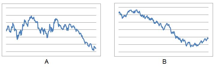
I took 200 or so consecutive days of Dow Jones Industrial Average prices from 2008, normalized them (divided by a fixed amount to make them all between 0 and 2), and then accidentally reversed them (well, Excel did that): the results can be seen in Graph A.
Click here to return to the original post.


[...] What I found most interesting about the process was how challenging it was to make a sequence of numbers that were essentially “random“ but looked like the stock market. It was harder than I thought, and the few people who knew how I did it seemed to have an easier time picking the correct graph. [...]