Statistics and Skew Dice
 To help our department prepare for the impending content shifts in our Algebra 2 course, I recently gave a demonstration lesson in probability and statistics. I was very lucky that my Skew Dice had just arrived!
Virtually everyone who encountered the skew dice had the same, immediate reaction: are the dice fair? This created an instant, authentic context for developing a wide variety of concepts and techniques in probability and statistics.
This simple question catalyzed natural mathematical conversations about what fairness means and how we might measure it. Transitioning from the intuitive notion that “each face should appear the same number of times” to a clear, rigorous mathematical characterization allowed us to wrestle with some fundamental statistical notions in a meaningful way.
I asked participants to propose tests for fairness, and then had them perform a test I had decided on ahead of time: roll the die 100 times and report the number of sixes. Before they began, I asked participants to consider how many sixes they would expect, and what numbers of observed sixes might suggest to them that the die was unfair.
The groups performed their tests and shared their data. We compared our results to our earlier intuitions, and talked about some ways we could interpret the data, touching on the rudiments of hypothesis testing.
A strength of this activity is that it creates opportunities to discuss modeling, experimental design, and data collection in meaningful ways: What assumptions did we make in our definitions of fairness? What assumptions underlie the test we conducted? What consequences follow from our choices about what data to collect, and how to collect it? All of these questions are interesting, important, and profoundly mathematical.
Another strength is that it engages participants in real mathematical inquiry, which I experienced firsthand when I performed the experiment myself. I ended up with an unusual number of 6s.

This prompted me to follow up with some more tests.
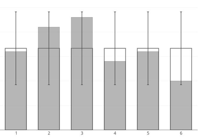
In the end, I felt confident with my conclusions, but the anomalous result had me reflecting on the process. As I thought about performing the test, I recalled frequently rolling the same number several times in a row. Luckily, the manner I chose to record the data allowed me to investigate how frequently I rolled consecutive numbers. The results were very surprising! This led me to ask, and contemplate, more questions about the skew dice. This is exactly the kind of mathematical experience I want students to have.
Skew dice are beautiful objects and great mathematical conversation starters. I highly recommend picking some up from The Dice Lab.
1 Comment
Amy Hogan · June 14, 2015 at 7:55 pm
Had a great time with the skew dice, Patrick. Hope this is just the beginning of some great Statistics presentations from you.